── Attaching core tidyverse packages ──────────────────────── tidyverse 2.0.0 ──
✔ dplyr     1.1.4     ✔ readr     2.1.6
✔ forcats   1.0.1     ✔ stringr   1.6.0
✔ ggplot2   4.0.1     ✔ tibble    3.3.1
✔ lubridate 1.9.4     ✔ tidyr     1.3.2
✔ purrr     1.2.1
── Conflicts ────────────────────────────────────────── tidyverse_conflicts() ──
✖ dplyr::filter() masks stats::filter()
✖ dplyr::lag()    masks stats::lag()
ℹ Use the conflicted package (<http://conflicted.r-lib.org/>) to force all conflicts to become errors
#library(conflicted)#filter <- dplyr::filter
Plotting with ggplot2
Arguably the most important part of data analysis is visualization, because it allows you to understand and communicate your data. The ggplot2 package, the first tidyverse package written, is one of the most powerful and versatile packages (You can read more about the ggplot2 package at its website https://ggplot2.tidyverse.org/)
To use ggplot2, you supply the data and an aesthetic mapping (what data you want to plot) to the ggplot() function and then add additional layers shaping how the data is plotted. For a look at all of the different plots you can make with ggplot2 the R Graph Gallery is an excellent resource https://www.r-graph-gallery.com/.
Today will focus on the basics of how to use ggplot, with all examples with the built-in iris dataset.
Basic ggplot syntax
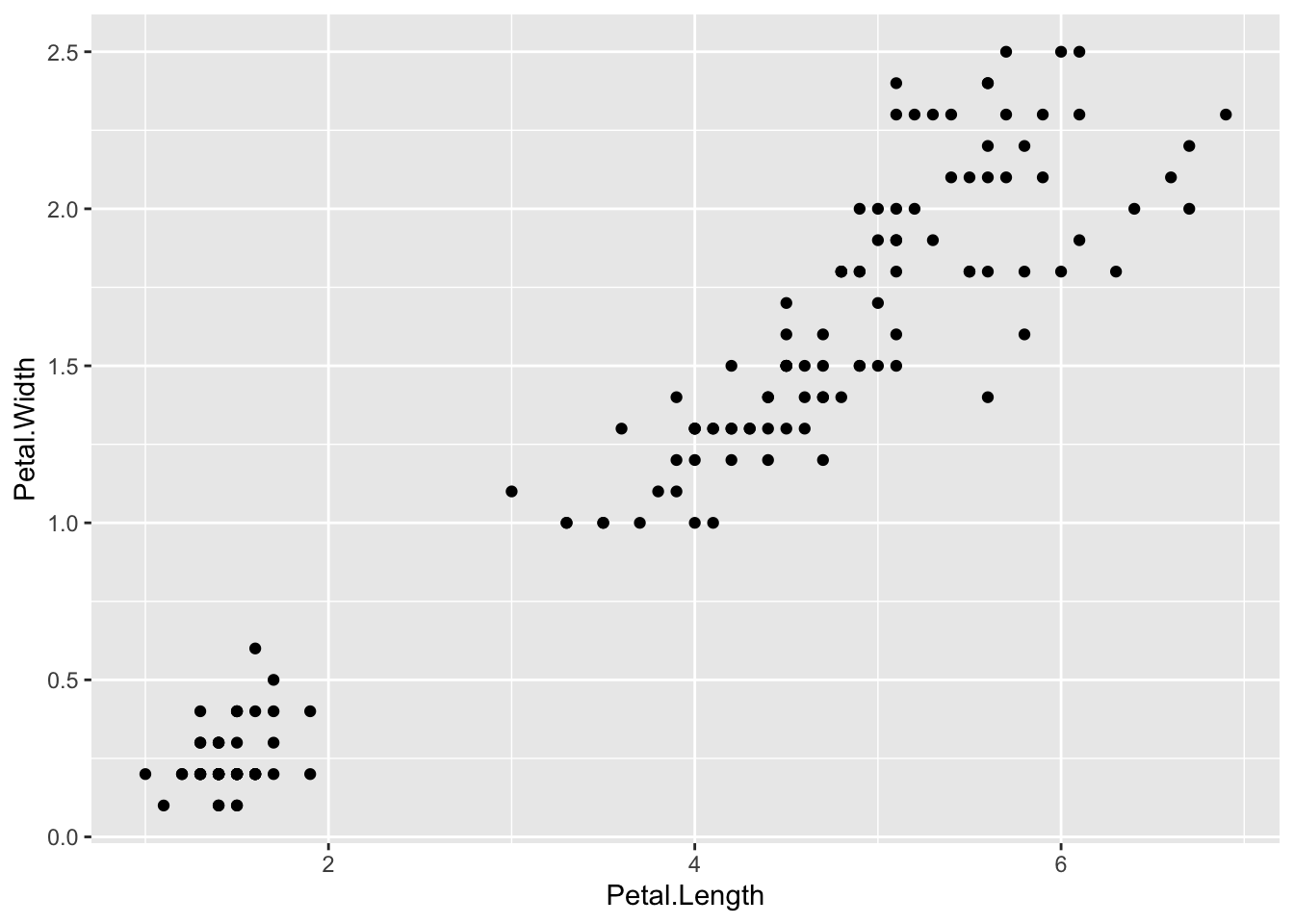
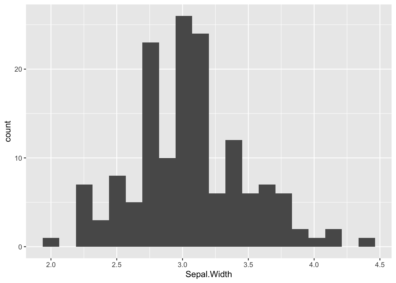
You have to specify a data table, at least one column from the table, and a geometry.
# plot(iris$Petal.Length, iris$Petal.Width)ggplot(iris, aes(x = Petal.Length, y = Petal.Width)) +geom_point()
The scale of the axes are automatically determined from the data and they’re labelled witht the column name.
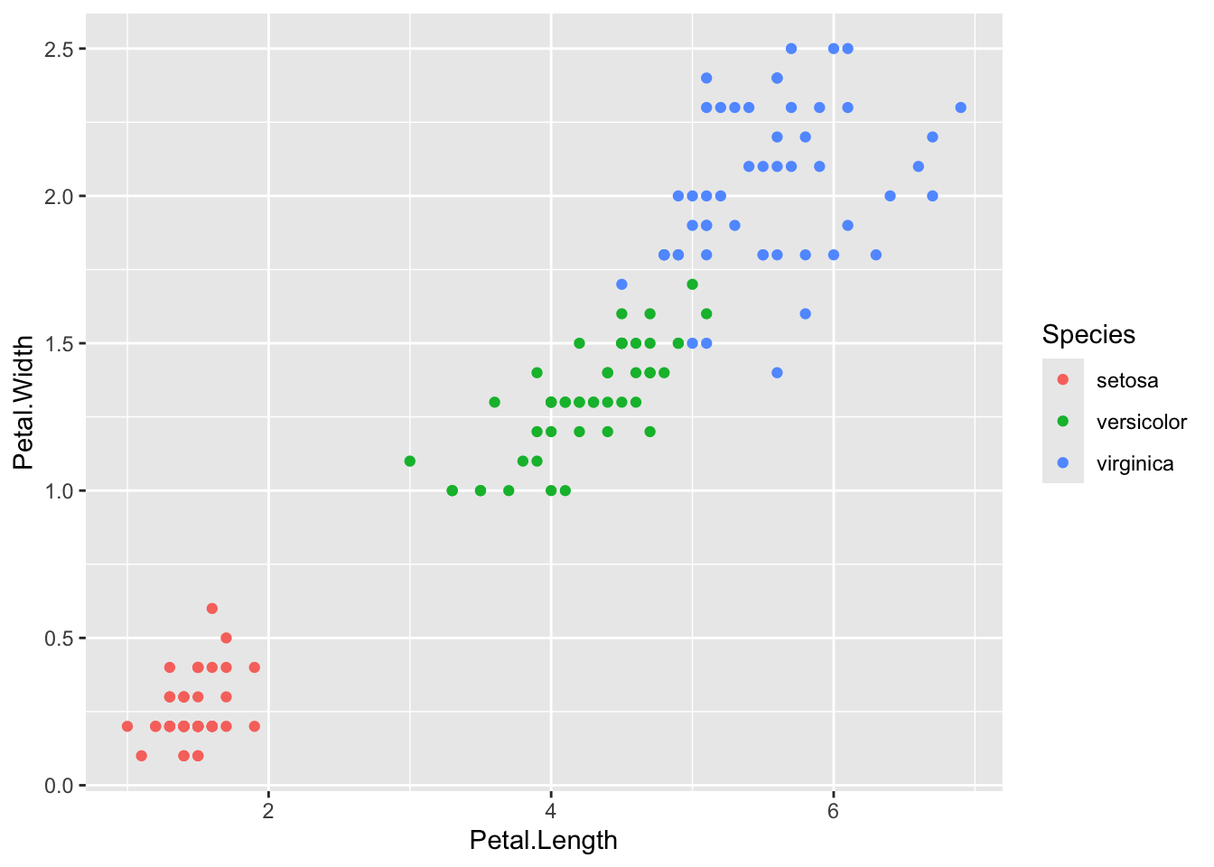
Adding an aesthetic like color modifies all the points and automatically adds a legend.
ggplot(iris, aes(x = Petal.Length, y = Petal.Width, color = Species)) +geom_point()
The legend title, like the axes labels, is the name of the column given to color = and the legend labels are whatever is in that column. For a continuous scale ggplot() will have a bar showing the range of colors and what values they correspond to.
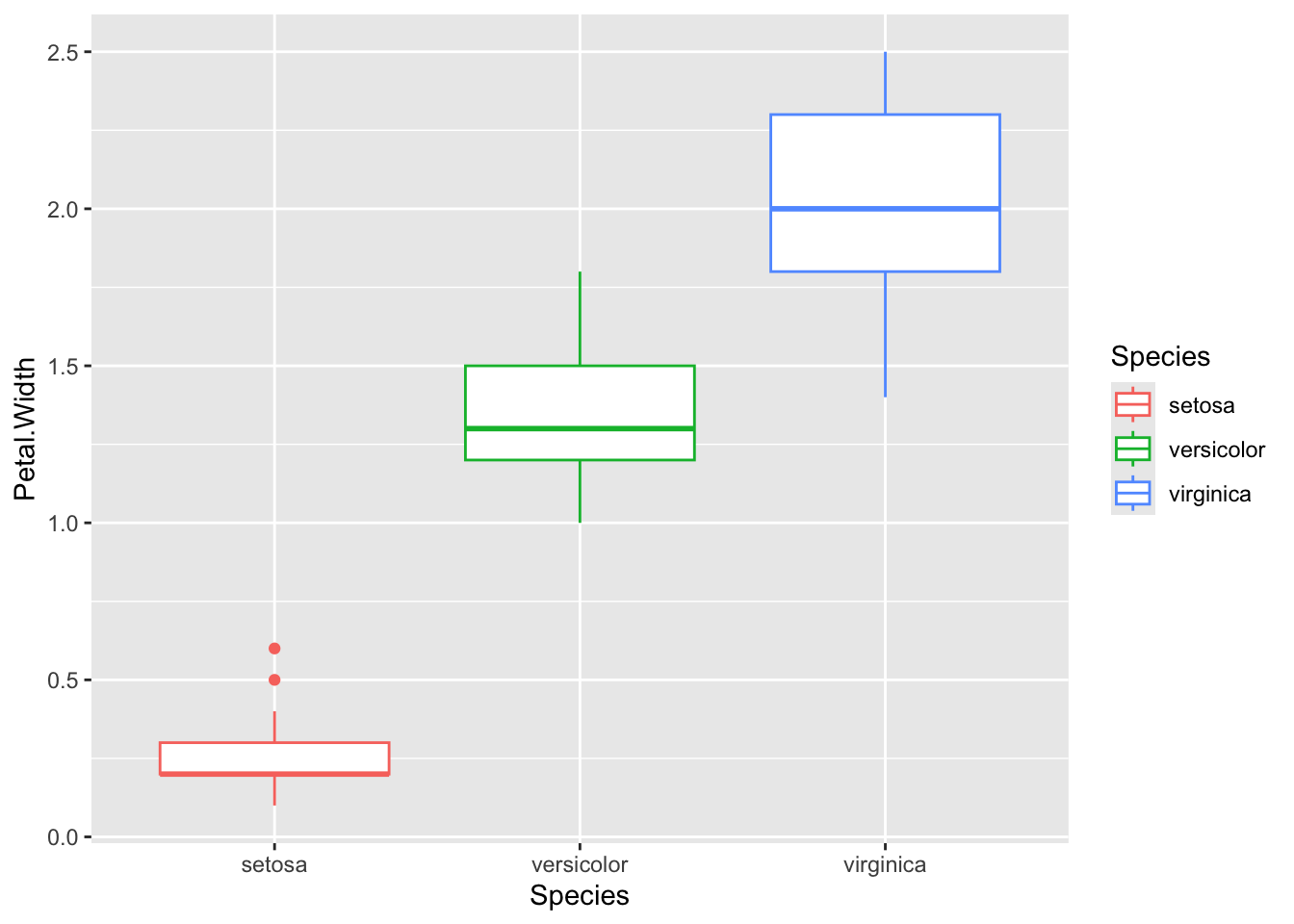
You just have to change the geom to change the plot to another geometry/type
iris %>%ggplot(aes(x = Species, y = Petal.Width, color = Species)) +geom_boxplot()
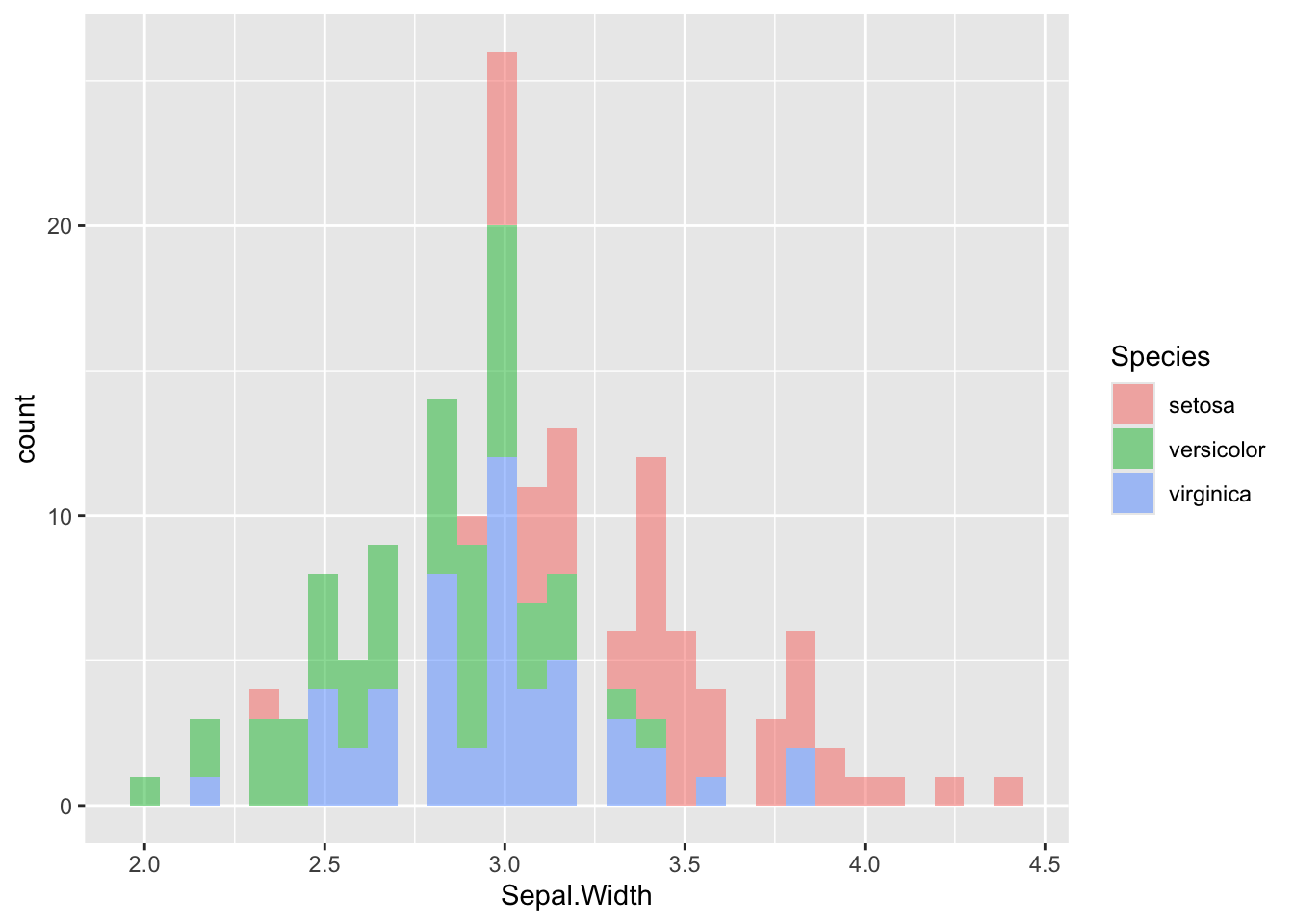
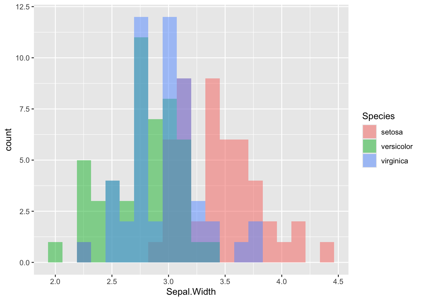
Be careful with histograms! By default, when you add fill, color, etc, geom_histogram() stacks the different bars on top of each other. For overlapping histograms, which are more effective visually and what people are used to seeing, use position = 'identity' inside of geom_histogram()
`stat_bin()` using `bins = 30`. Pick better value `binwidth`.
# use position = 'identity' for overlapping histogramsggplot(iris, aes(x = Sepal.Width, fill = Species)) +geom_histogram(position ='identity', alpha =0.5, bins =20)
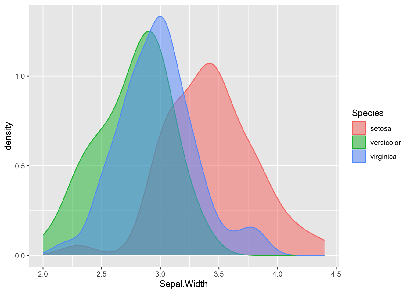
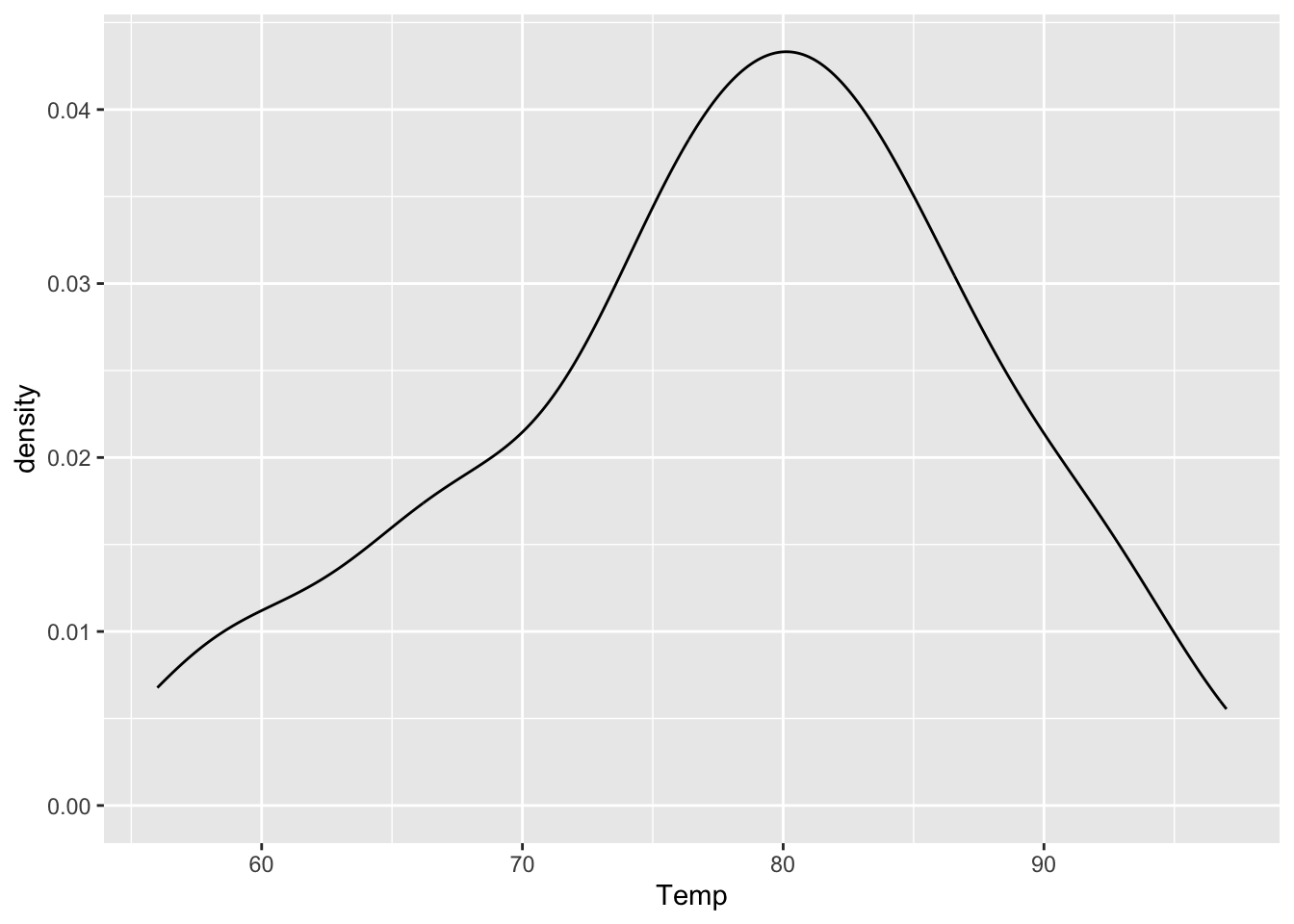
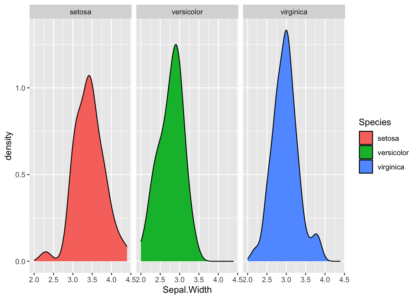
Density plot
ggplot(iris, aes(x = Sepal.Width, fill = Species, color = Species)) +geom_density(alpha =0.5)
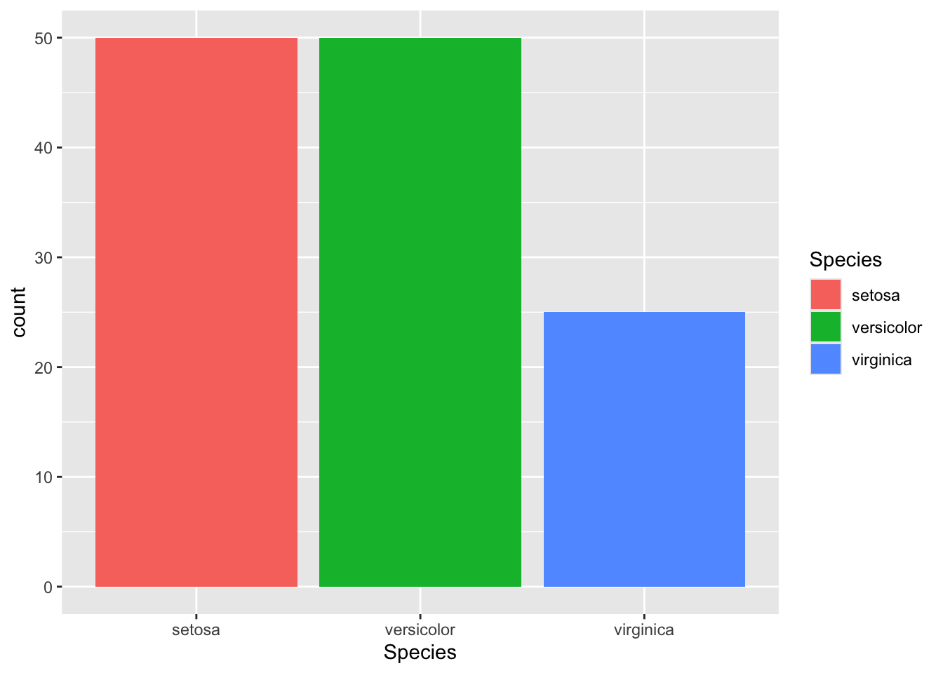
ggplot(iris[1:125,], aes(x = Species, fill = Species)) +geom_bar()
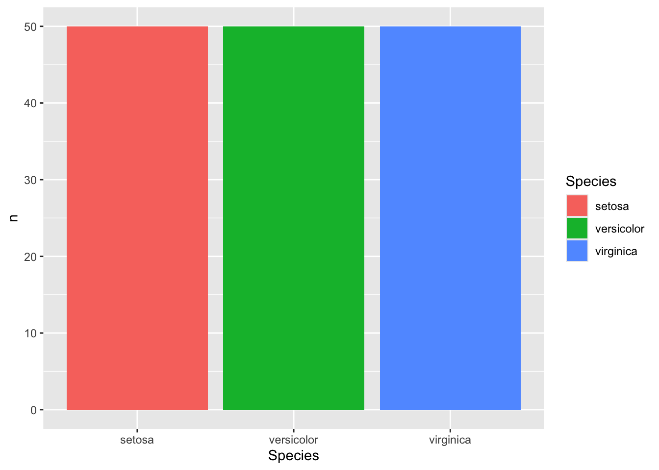
geom_bar() counts the variable for you. If you have an existing count you want to use, you have to use either geom_bar(stat = 'identity') or geom_col()
### geom_bar()iris %>%count(Species) %>%# have to give the count as the argument for y nowggplot(aes(x = Species, y = n, fill = Species)) +geom_bar(stat ='identity')
### geom_col()iris %>%count(Species) %>%ggplot(aes(x = Species, y = n, fill = Species)) +geom_col()
Two Variables
Continuous X, Continuous Y
Scatter plot
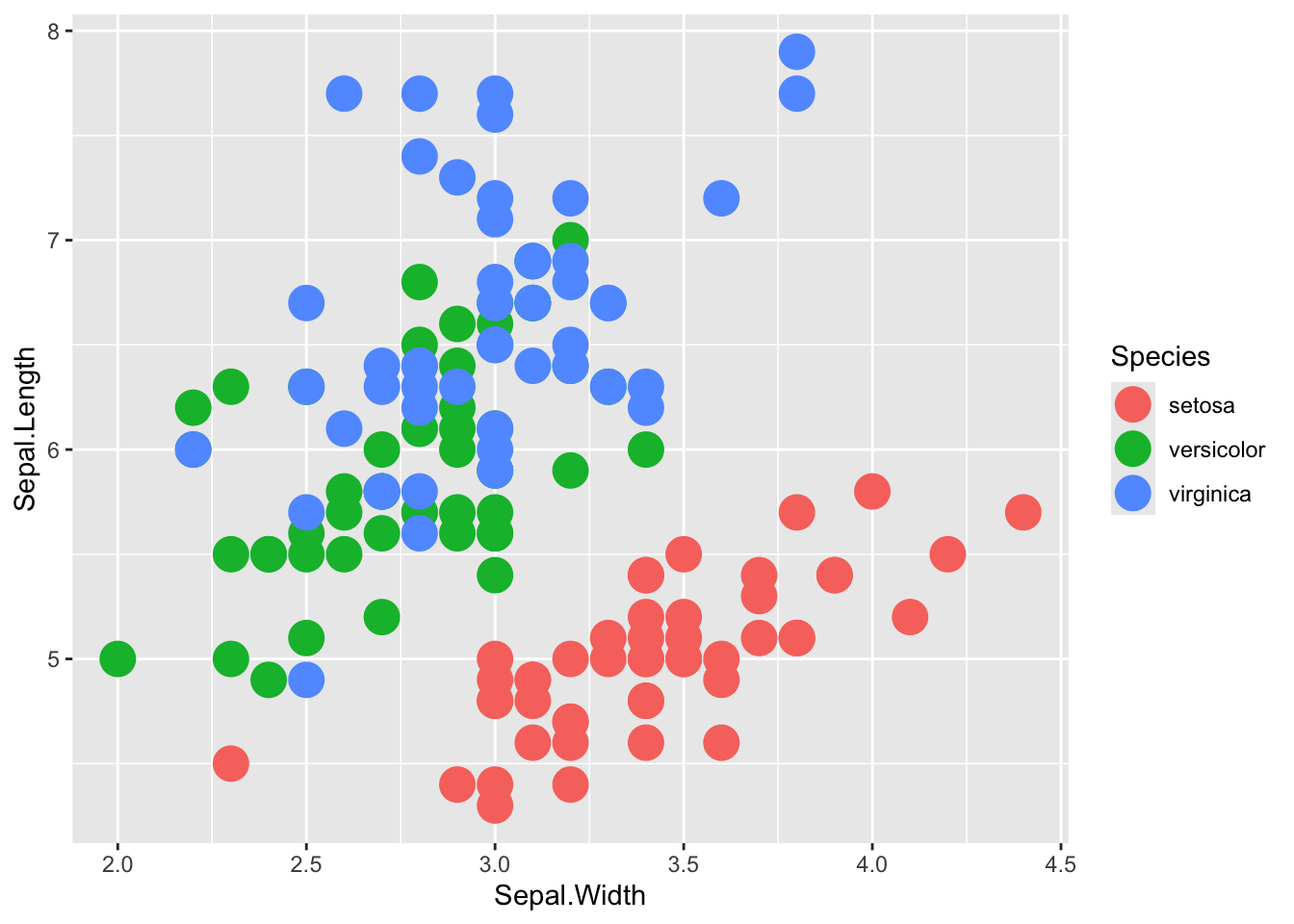
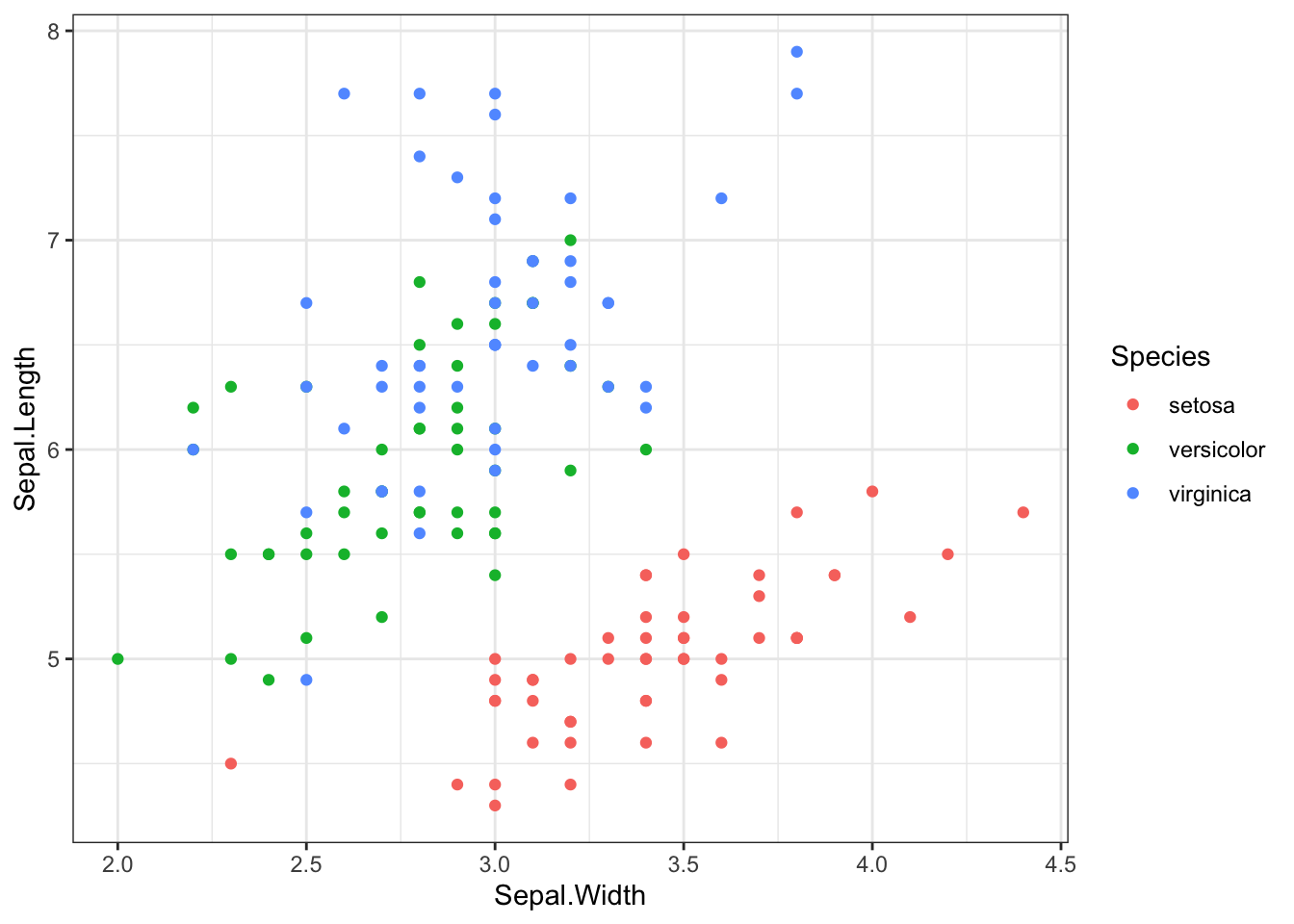
ggplot(iris, aes(x = Sepal.Width, y = Sepal.Length, color = Species)) +geom_point()
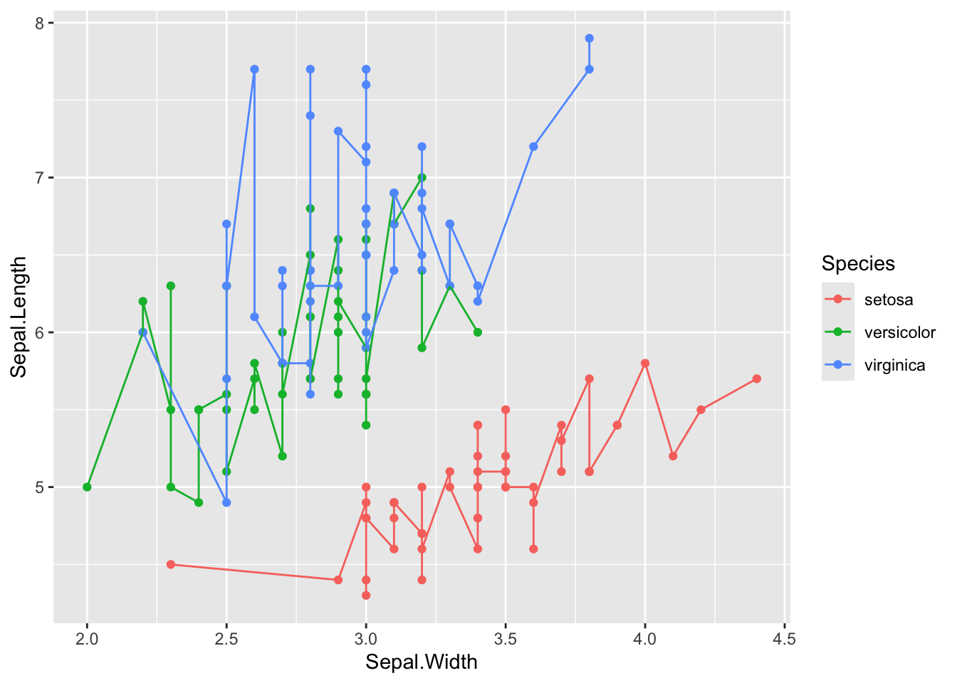
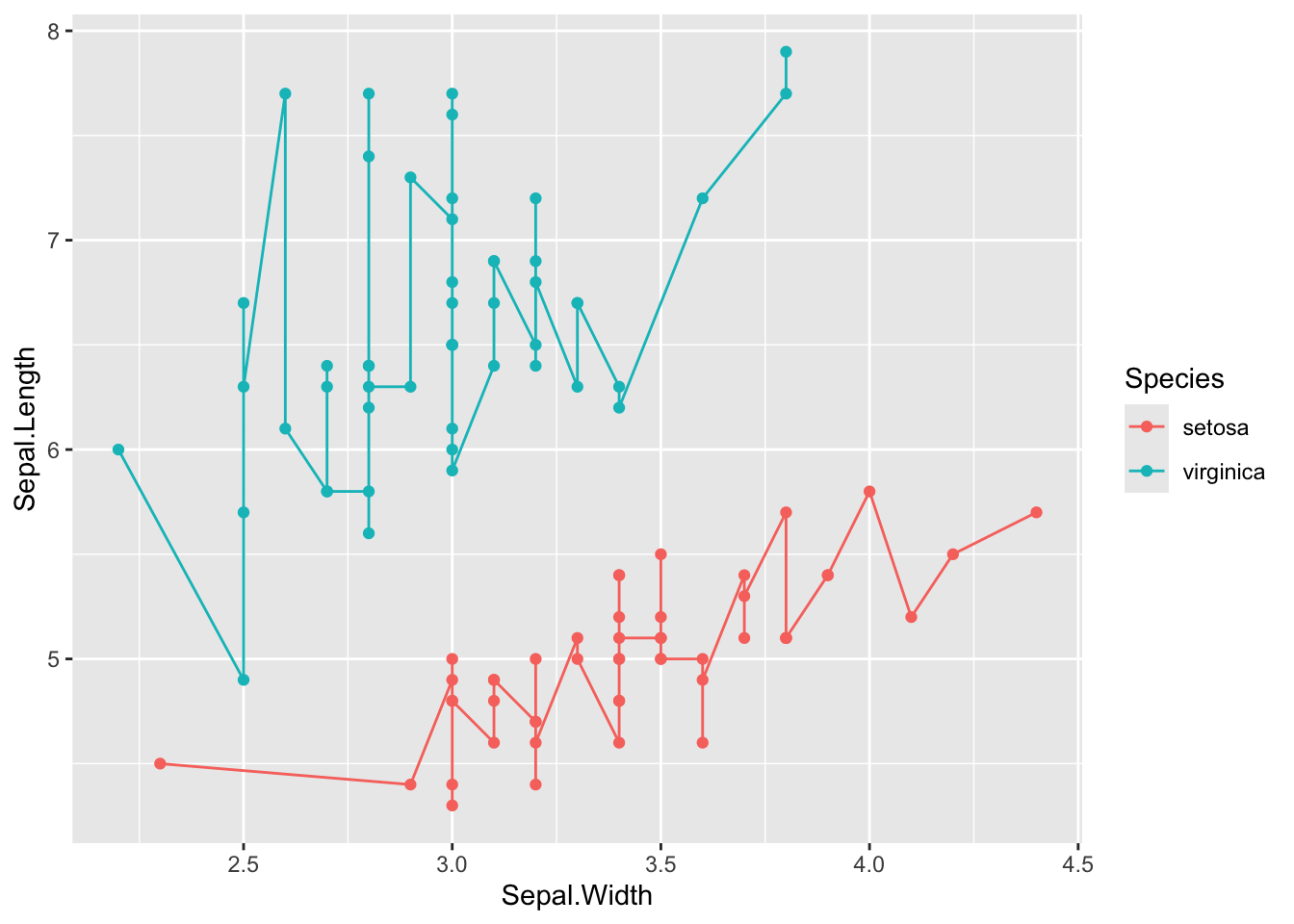
Line plot
ggplot(iris, aes(x = Sepal.Width, y = Sepal.Length, color = Species)) +geom_point() +geom_line()
iris %>%filter(Species !="versicolor") %>%ggplot(aes(x = Sepal.Width, y = Sepal.Length, color = Species)) +geom_point() +geom_line()
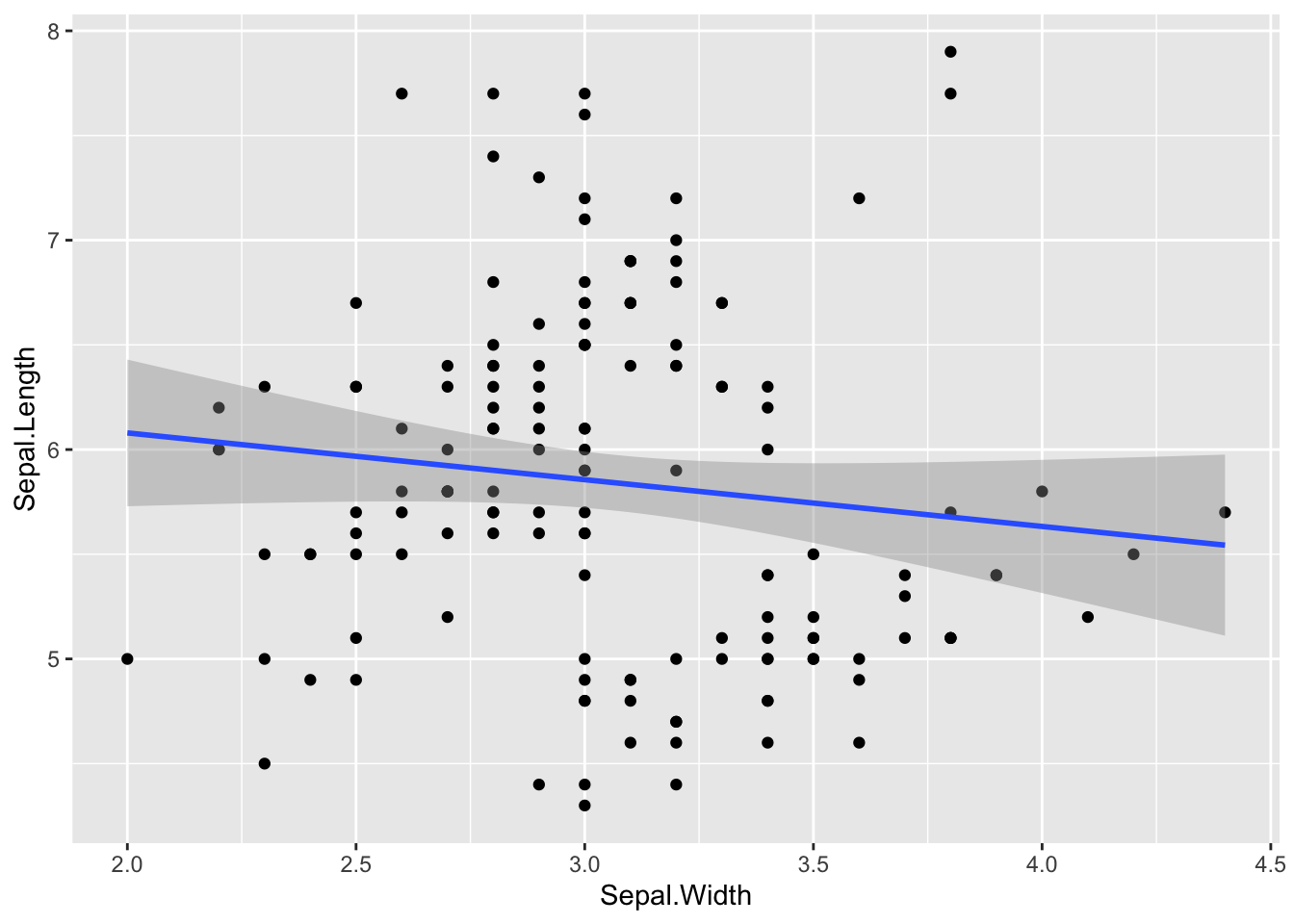
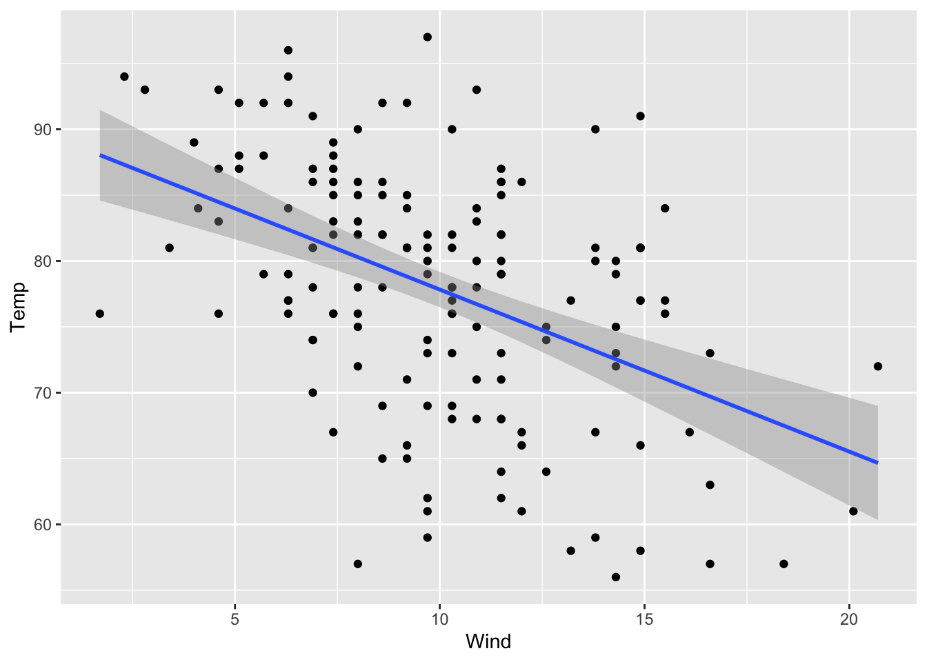
If you want to fit a straight line (or other type of fit) to your scatter plot, add on geom_smooth(). Use method = lm inside it to add a line (see the geom_smooth() documentation for other fit methods). Also, it automatically supplies confidence intervals with whatever is fit.
# with line of best fitggplot(iris, aes(x = Sepal.Width, y = Sepal.Length)) +geom_point() +geom_smooth(method = lm)
`geom_smooth()` using formula = 'y ~ x'
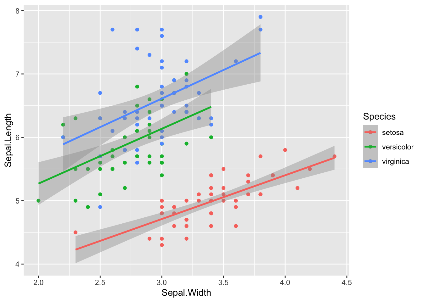
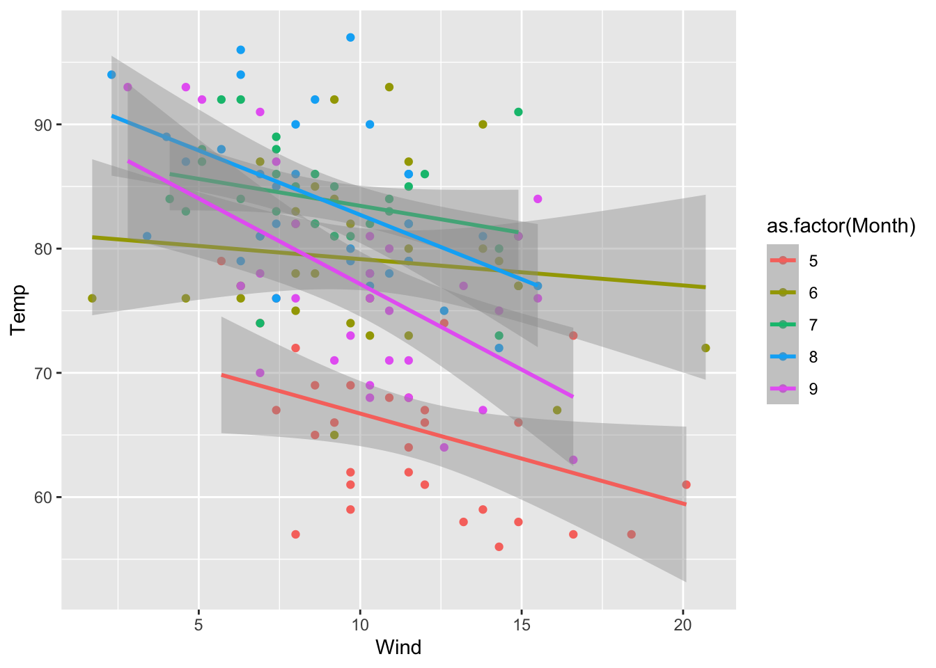
# if you color by something, each subgroup will automatically get it's own lineggplot(iris, aes(x = Sepal.Width, y = Sepal.Length, color = Species)) +geom_point() +geom_smooth(method = lm)
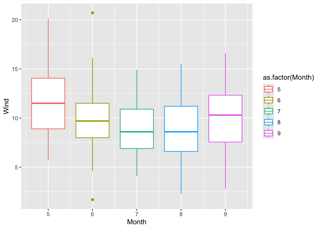
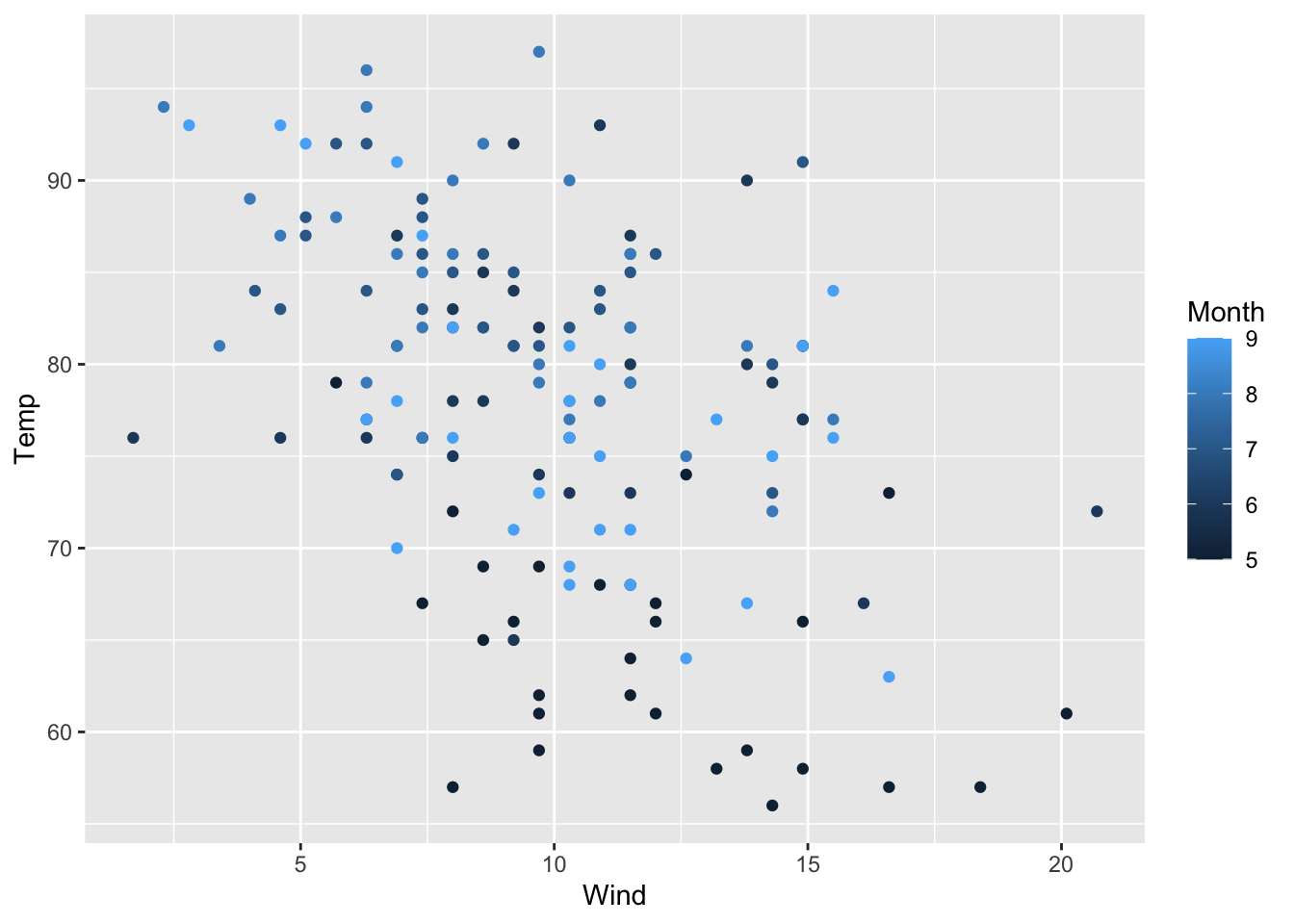
airquality %>%ggplot(aes(x = Wind, y = Temp, color =as.factor(Month))) +geom_point() +geom_smooth(method = lm)
`geom_smooth()` using formula = 'y ~ x'
Discrete X, Continuous Y
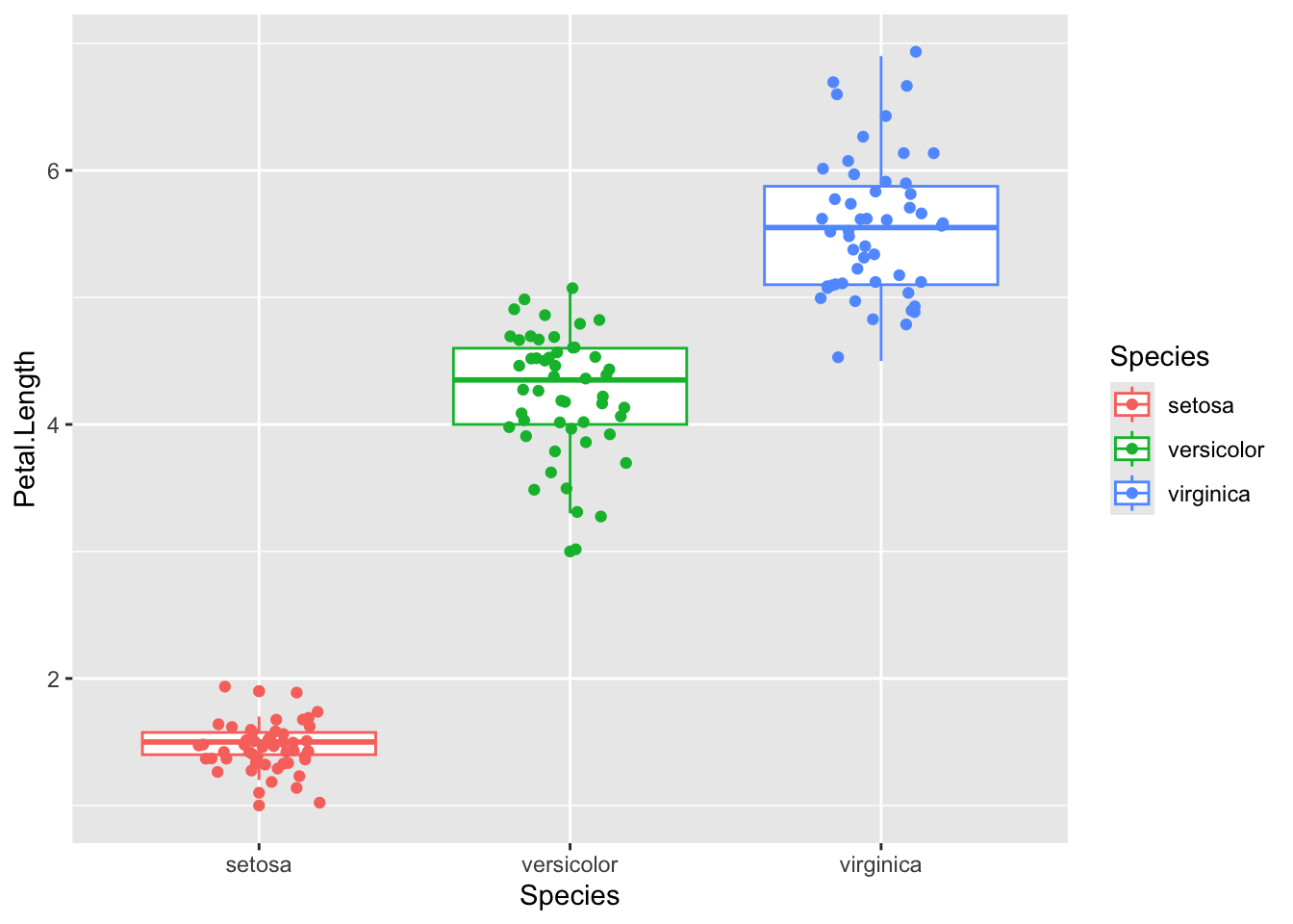
Boxplot
ggplot(iris, aes(x = Species, y = Petal.Length, color = Species)) +geom_boxplot() +geom_jitter(width =0.2)
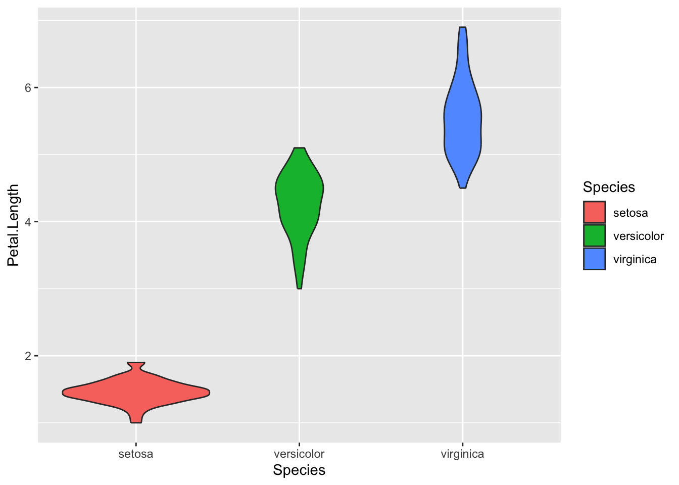
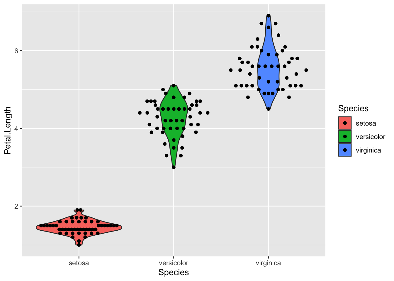
Violin plot
A violin plot is a mirrored density plot displayed like a boxplot. It gives you a better sense of the distribution of the underlying data than the five number summary of the boxplot.
ggplot(iris, aes(x = Species, y = Petal.Length, fill = Species)) +geom_violin()
If you want to overlay a bar/boxplot/violin plot with the actual data points, you can add geom_jitter() on
ggplot(iris, aes(x = Species, y = Petal.Length, fill = Species)) +geom_violin() +geom_jitter()
Even better than geom_jitter, there’s the ggbeeswarm package, which has different geoms for overlaying jittered points according to the underlying distribution. See the GitHub README for more documentation/examples https://github.com/eclarke/ggbeeswarm
# uncomment and install if you want# install.packages('ggbeeswarm')
library(ggbeeswarm)# example 1ggplot(iris, aes(x = Species, y = Petal.Length, fill = Species)) +geom_violin() +geom_quasirandom()
# example 2 with modified methodggplot(iris, aes(x = Species, y = Petal.Length, fill = Species)) +geom_violin() +geom_quasirandom(method ='smiley')
Aesthetics
Basics
Color
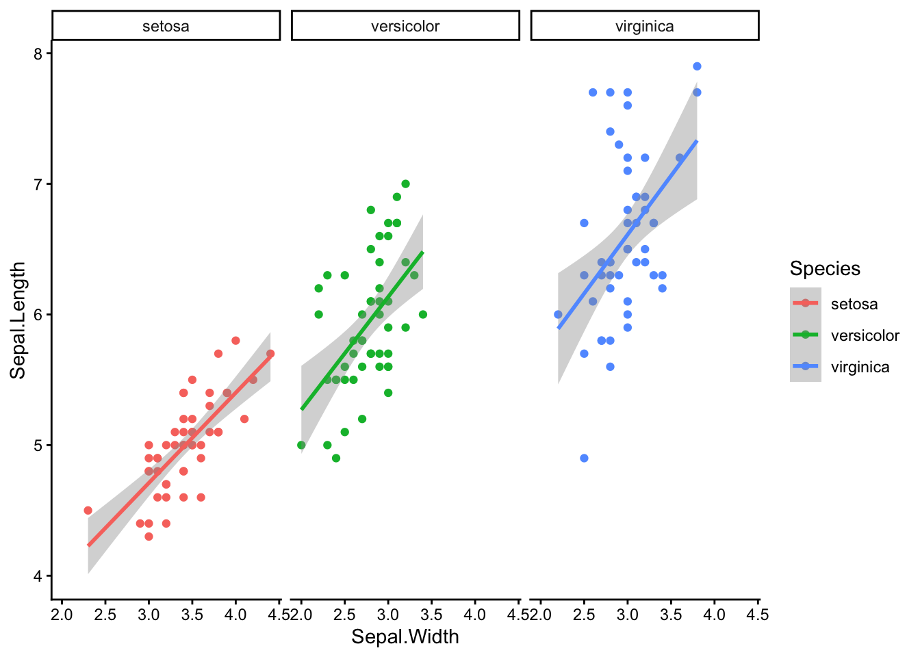
ggplot(iris, aes(x = Sepal.Width, y = Sepal.Length, color = Species)) +geom_point() +facet_wrap( ~ Species) +geom_smooth(method = lm) +theme_classic()
Warning: Using size for a discrete variable is not advised.
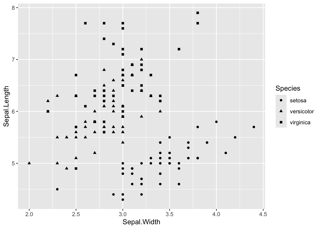
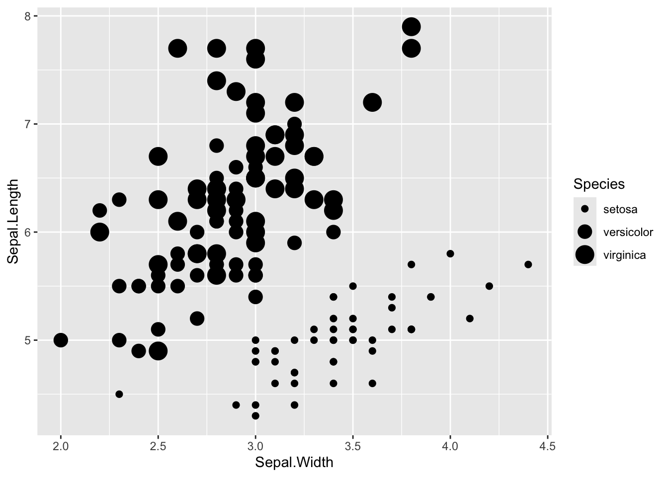
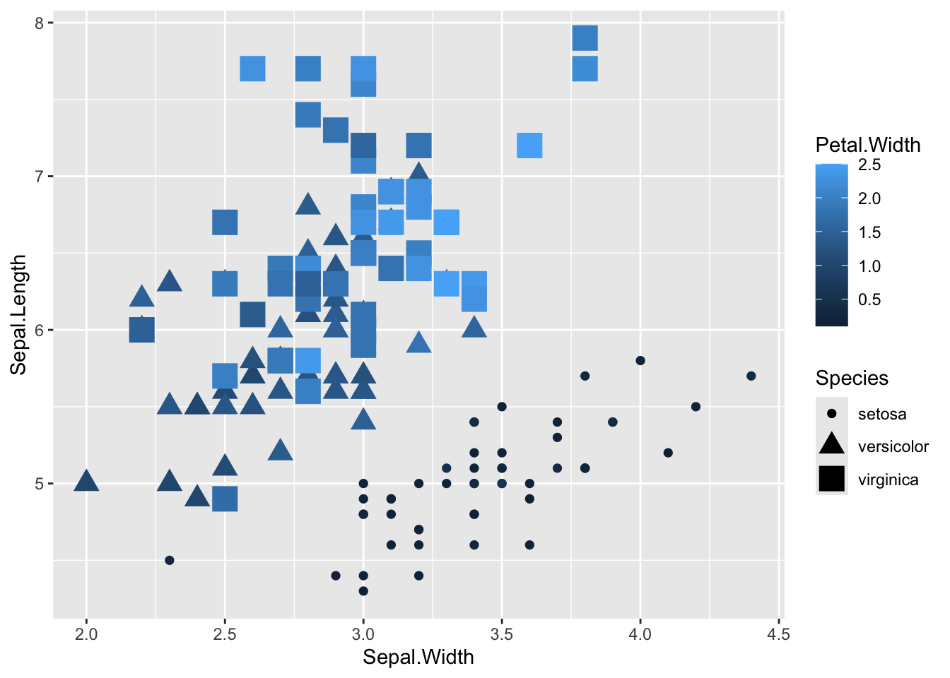
Combine as many as you want
Even though this is a bad idea, because it’s more information than people can really take in
ggplot(iris, aes(x = Sepal.Width, y = Sepal.Length, color = Petal.Width, shape = Species, size = Species)) +geom_point()
Warning: Using size for a discrete variable is not advised.
Miscellaneous Useful Stuff to Know
More about aes()
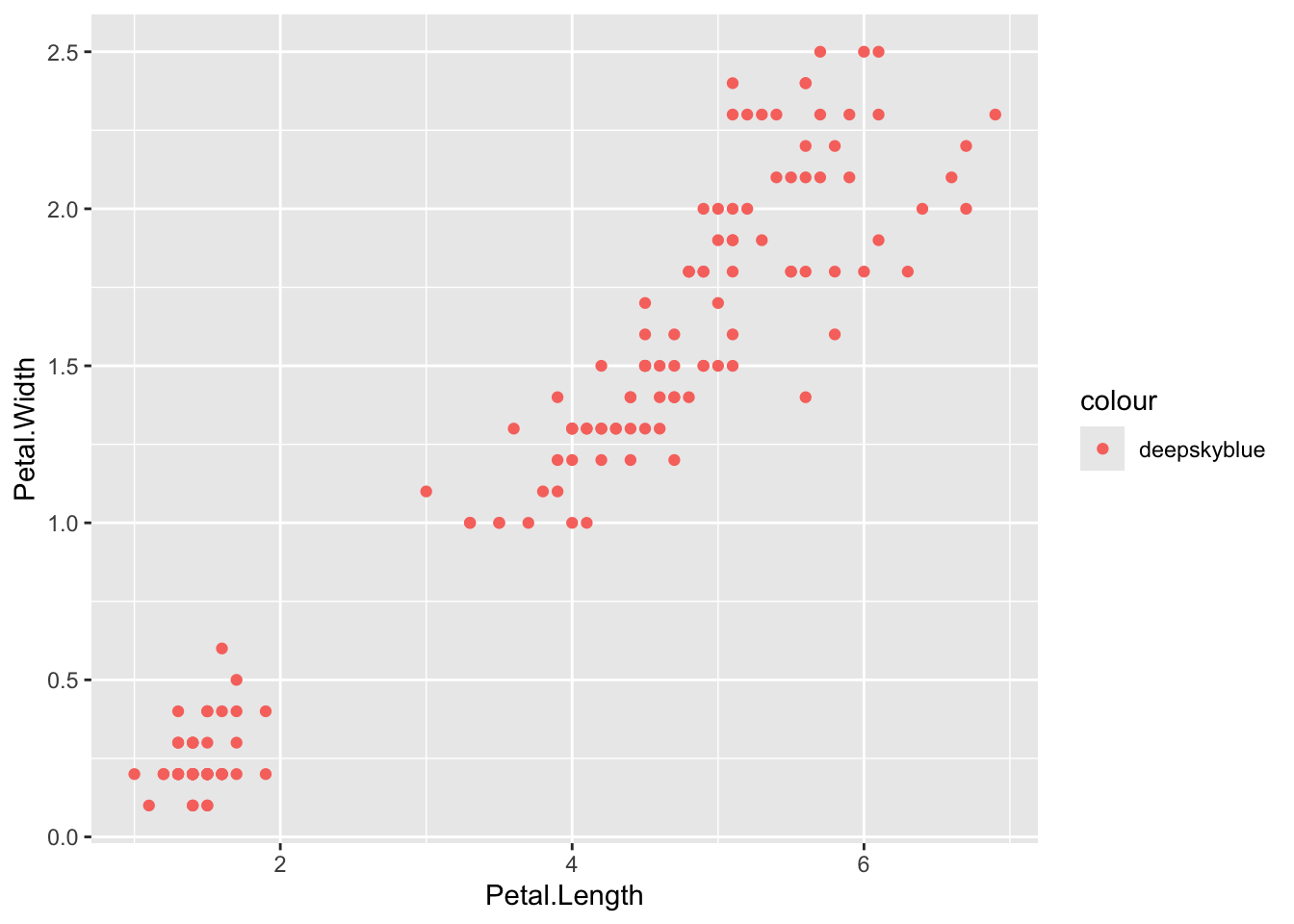
Whether you add color (or shape, size, etc.) inside or outside of ‘aes()’ has a different outcome. Inside aes() ggplot modifies points differently, but outside aes() it applies the same thing to all points.
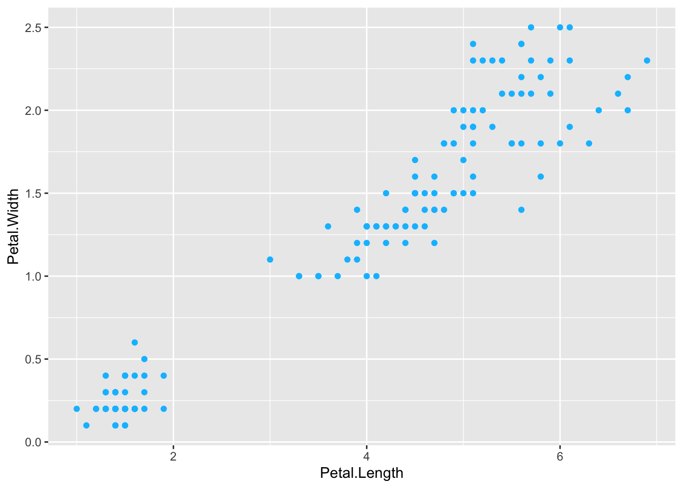
# where we've had itggplot(iris, aes(x = Petal.Length, y = Petal.Width, color = Species)) +geom_point()
# I just want my points to be another colorggplot(iris, aes(x = Petal.Length, y = Petal.Width)) +geom_point(color ='deepskyblue')
# BUT if I put color = 'deepskyblue' instead an aes() it won't work; ggplot thinks it's a data featureggplot(iris, aes(x = Petal.Length, y = Petal.Width, color ='deepskyblue')) +geom_point()
# ALSO if I DON'T put color = Species inside aes() it throws an error# uncomment the line below and try#ggplot(iris, aes(x = Petal.Length, y = Petal.Width)) + geom_point(color = 'Species')
You can also put aes() inside either ggplot() or whatever geom you pick
# inside ggplot()ggplot(iris, aes(x = Petal.Length, y = Petal.Width, color = Species)) +geom_point()
# inside geom_point()ggplot(iris) +geom_point(aes(x = Petal.Length, y = Petal.Width, color = Species))
Alpha
The alpha = parameter sets the transparency of the plot. Alpha ranges from 0 to 1, where 0 is completely transparent and 1 is completely solid. Making your plots partially transparent is helpful when you have overplotting or any overlapping. (I made the points bigger to make the difference in alpha easier to see)
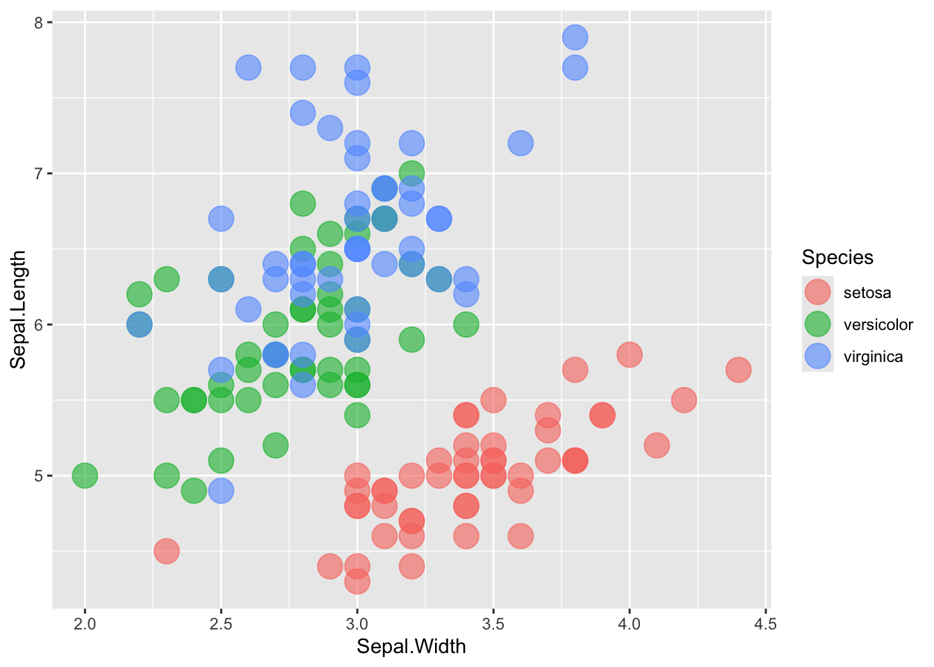
# without transparencyggplot(iris, aes(x = Sepal.Width, y = Sepal.Length, color = Species)) +geom_point(size =6)
# with transparencyggplot(iris, aes(x = Sepal.Width, y = Sepal.Length, color = Species)) +geom_point(size =6, alpha =0.6)
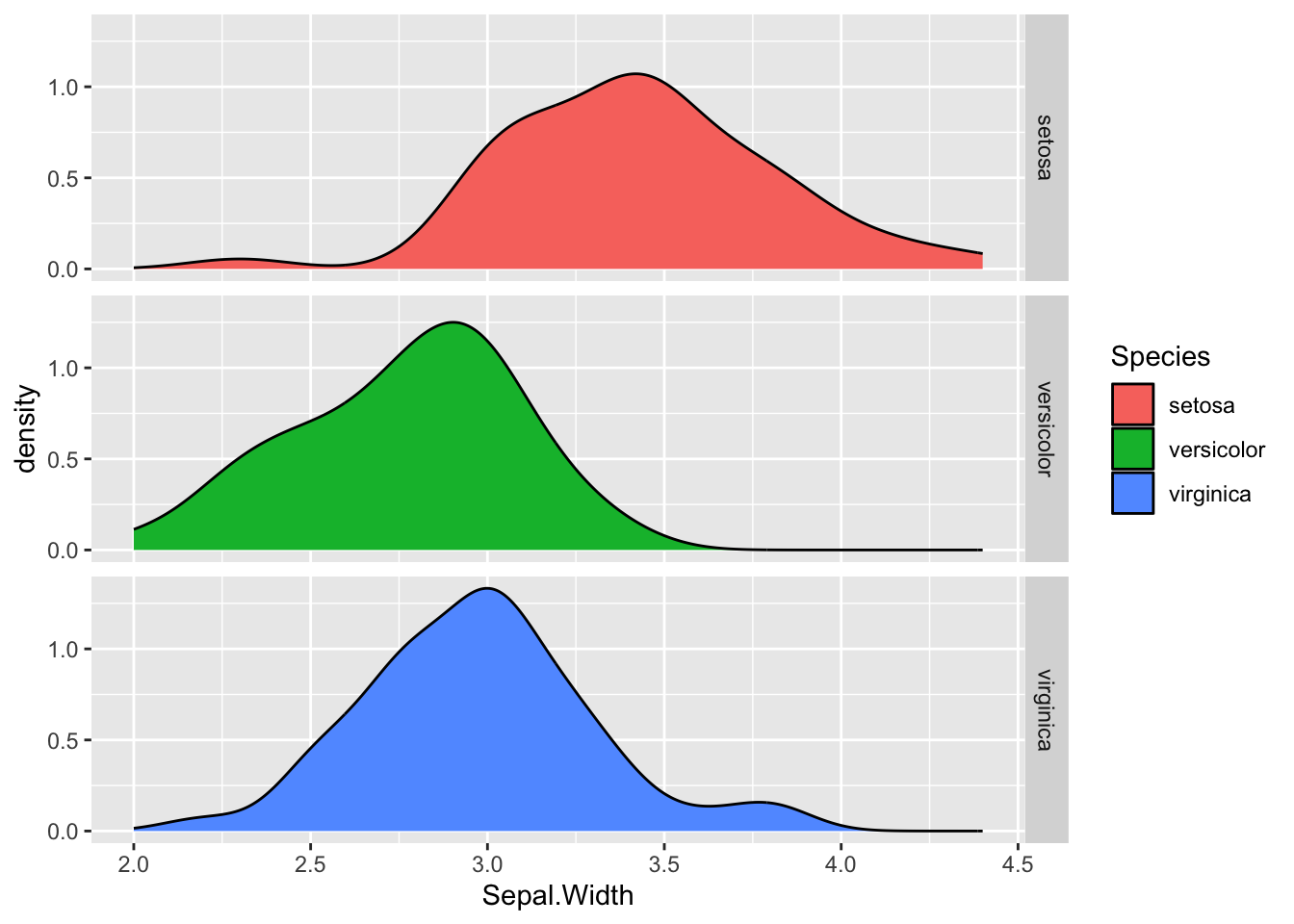
facets
Sometimes you might want to make multiple plots based on an element in your data like: significant/not significant, sample, phenotype, etc. If it’s a label in your table, you can add a facet to automatically split it.
You can also use facet_wrap() instead, which will automatically wrap your facets (this isn’t an issue with the iris examples here, but as you add 5, 10, 15 facets, I prefer this)
The best practice is to have your column names and labels in your data table formatted nicely so you can plot and not think about it. But someimes that isn’t possible or you don’t think about it and you need to rename axis, legend, etc. The easiest, with labs()
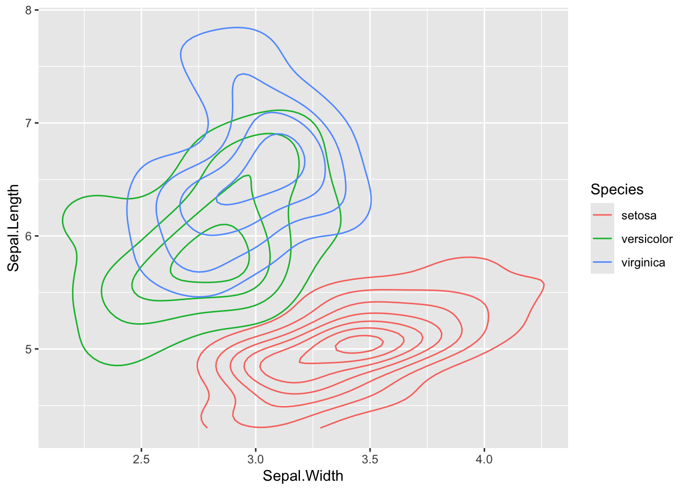
# plot before labellingggplot(iris, aes(x = Sepal.Width, y = Sepal.Length, color = Species)) +geom_density_2d()
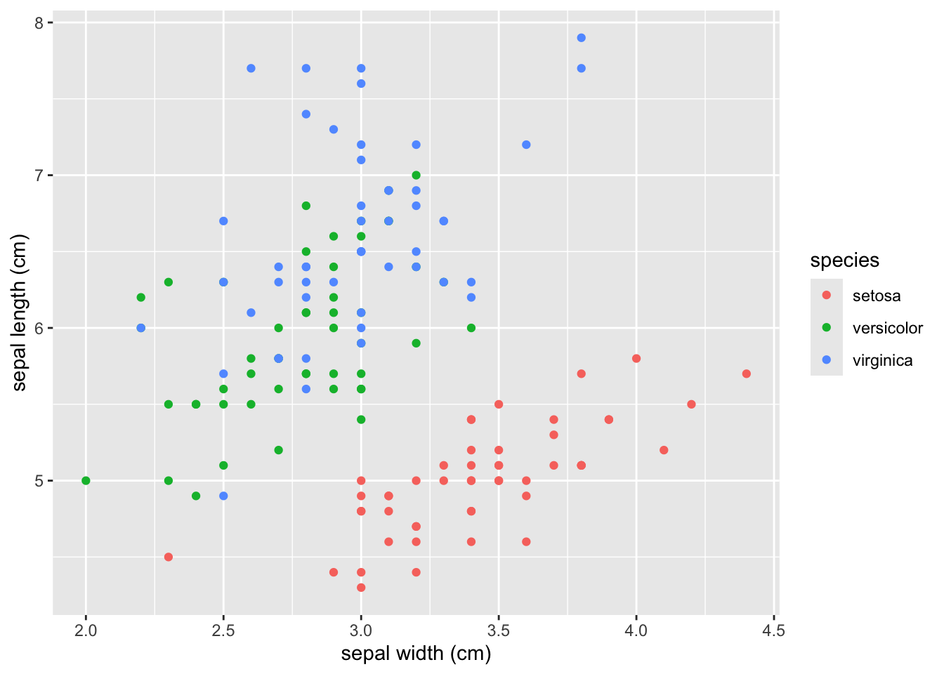
# with labels addedggplot(iris, aes(x = Sepal.Width, y = Sepal.Length, color = Species)) +geom_point() +labs(x ='sepal width (cm)', y ='sepal length (cm)', color ='species')
You can also modify the labels (and make more extensive modifications but only labels are shown here) with ’scale_??()`. The syntax is scale + + plot part to modify + type of data (discrete or continuous mainly). These are the scale modifiers you’ll use most often:
scale_x_discrete()
scale_x_continuous()
scale_y_discrete()
scale_y_continuous()
scale_color_discrete()
scale_color_continuous()
scale_color_manual()
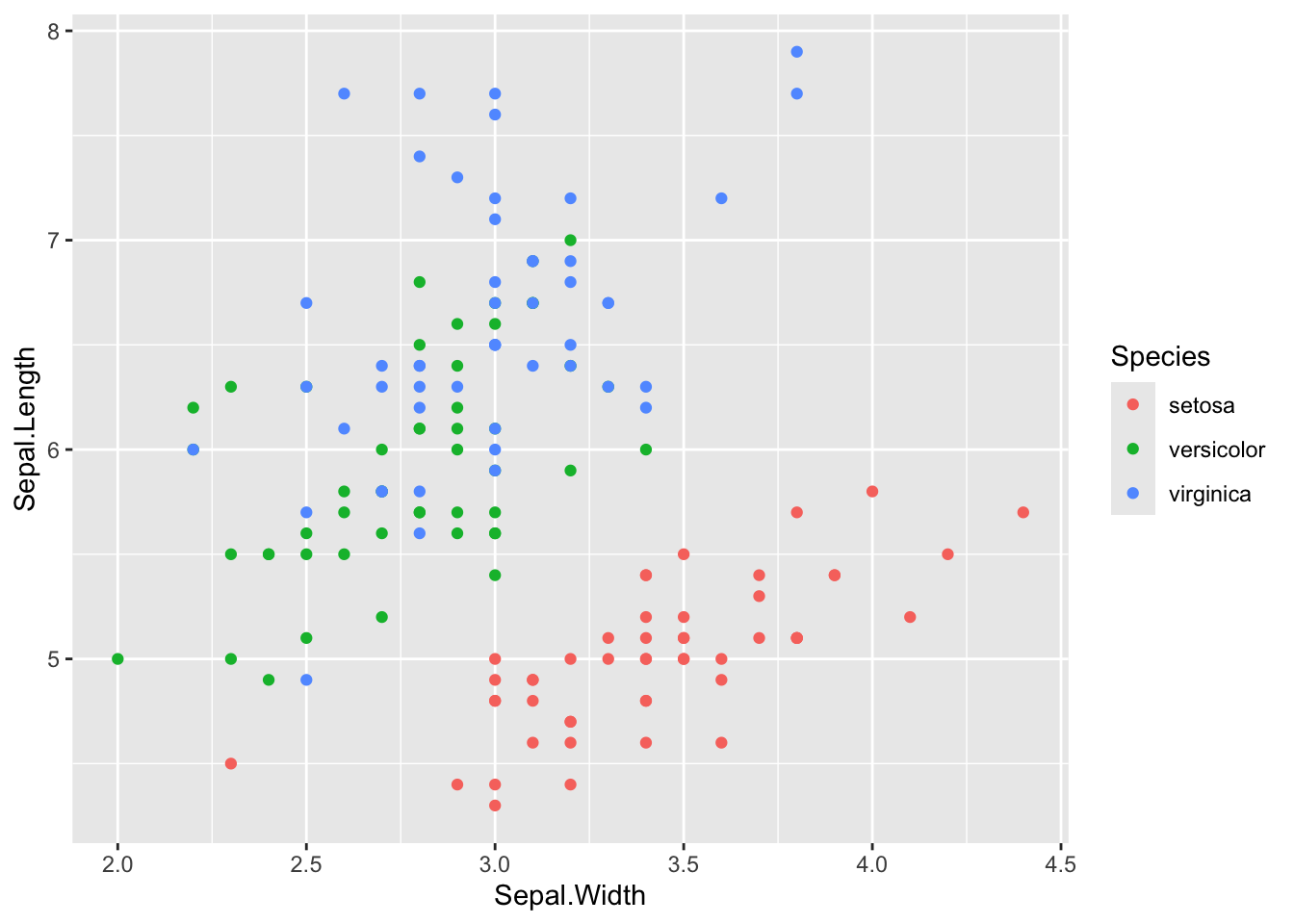
ggplot(iris, aes(x = Sepal.Width, y = Sepal.Length, color = Species)) +geom_point() +scale_x_continuous(name ='sepal width (cm)') +scale_y_continuous('sepal length (cm)') +scale_color_discrete('species')
themes
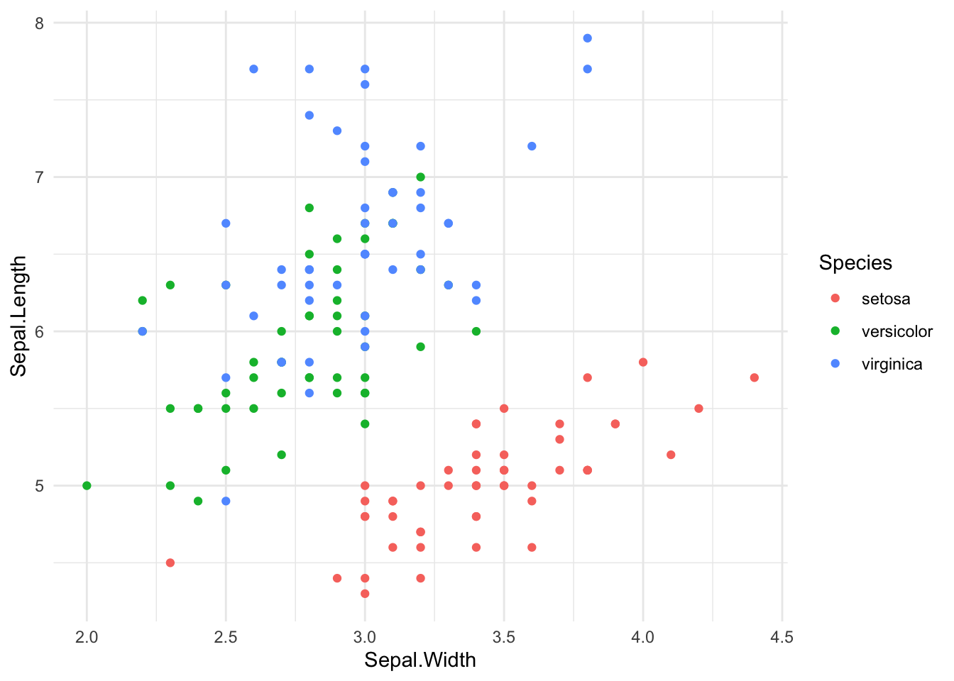
The default theme in ggplot with the light gray background is kind of ugly, so people usually modify it with theme_*(). I’ve previewed the most common 3 below, but they all pop up if you type ?theme_classic() in the console (or Google ggplot package themes)
default
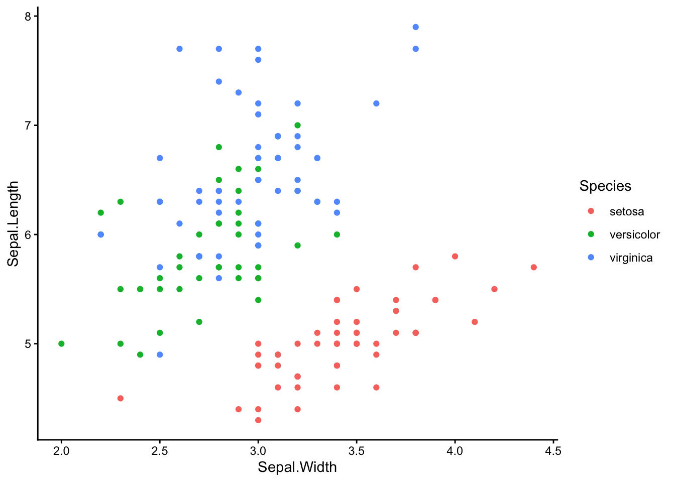
# default themeggplot(iris, aes(x = Sepal.Width, y = Sepal.Length, color = Species)) +geom_point()
theme_classic() This is the one I use
ggplot(iris, aes(x = Sepal.Width, y = Sepal.Length, color = Species)) +geom_point() +theme_classic()
theme_minimal()
ggplot(iris, aes(x = Sepal.Width, y = Sepal.Length, color = Species)) +geom_point() +theme_minimal()
theme_bw()
ggplot(iris, aes(x = Sepal.Width, y = Sepal.Length, color = Species)) +geom_point() +theme_bw()
For fun, try theme_void() on something. There are also many, many packages with more ggplot themes you can install.
colorful: It has the largest difference possible between the starting color value and the ending color value for to make differences easy to see
perceptually uniform: The change from the starting color value to the ending color happens at the same right so the differences in similar appearing colors are the same across the color scale
color blind friendly: 8.5% of people (at least in the US) have some form of colorblindness. Chances are there’s a colorblind person viewing your paper. Viridis is designed so that color blind people will still see contrasts. Also, viridis still has contrast in greyscale, so it works if a figure is printed in black and white or for someone completely colorblind.
It looks pretty
Get started
If it’s not already installed, install the package
#install.packages('viridis')
You have to load the package before you can use the color scale
library(viridis)
Loading required package: viridisLite
Viridis coloring by discrete variable
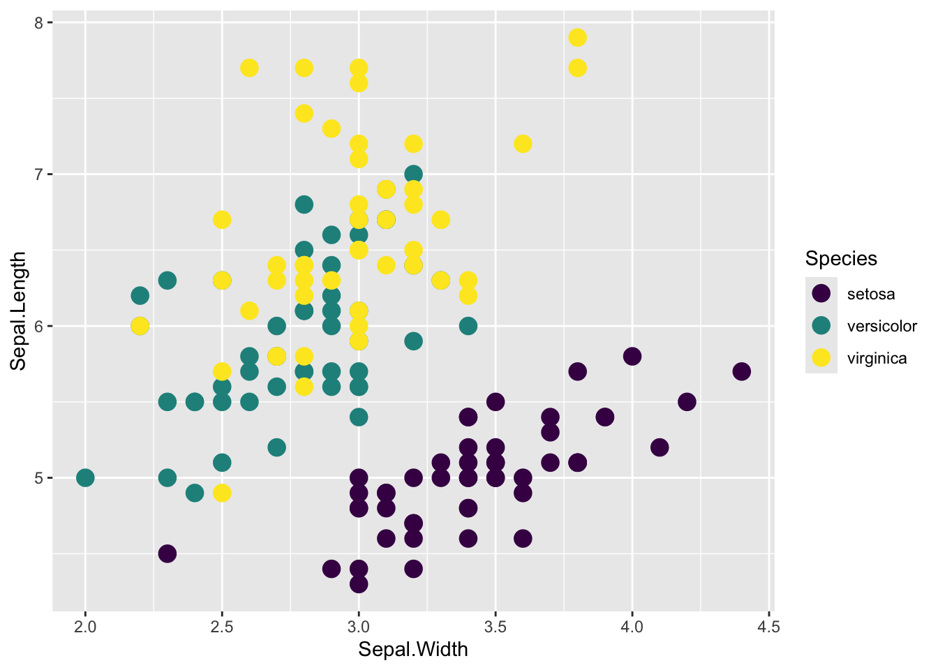
# two different ways of specifying a discrete scale; continuous is the defaultggplot(iris, aes(x = Sepal.Width, y = Sepal.Length, color = Species)) +geom_point(size =4) +scale_color_viridis(discrete =TRUE)
### ORggplot(iris, aes(x = Sepal.Width, y = Sepal.Length, color = Species)) +geom_point(size =4) +scale_color_viridis_d()
Viridis coloring by a continuous variable
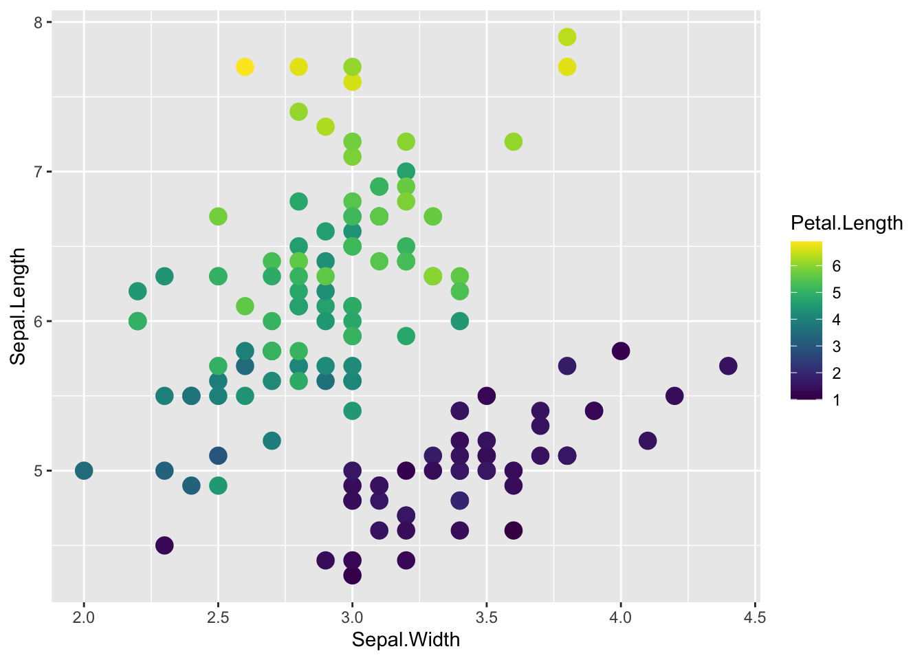
The viridis scale has better contrast than the default ggplot color scale for continuous coloring
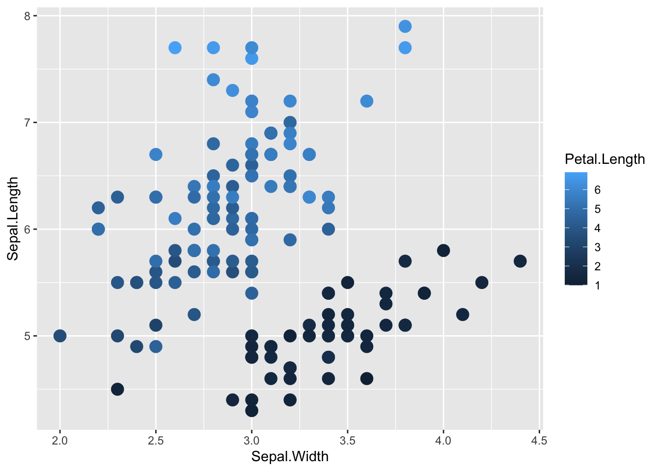
# default ggplot() continuous color scaleggplot(iris, aes(x = Sepal.Width, y = Sepal.Length, color = Petal.Length)) +geom_point(size =4)
# viridis continuous color scaleggplot(iris, aes(x = Sepal.Width, y = Sepal.Length, color = Petal.Length)) +geom_point(size =4) +scale_color_viridis()